OVERVIEW
Weee! is a leading grocery delivery app specializing in fresh Asian and Hispanic groceries. As the digital grocery industry grows, more North American households are turning to online shopping for its convenience. This conceptual Group Cart feature aims to enhance the Weee! experience by enabling users to collaborate on orders, making group shopping easier.
PROJECT SCOPE
Feature Add-on, Concept
ROLE
UX Designer / UX Researcher / Branding
TOOLS
Figma, Miro, Google Suite
DURATION
11 weeks
THE CHALLENGE
Currently, Weee! customers do not have the option to collaborate on a shopping cart, limiting the ability to shop together for shared groceries.
COMPETITIVE ANALYSIS

Most skincare apps served as routine trackers or journals. Telehealth apps focused on client portals but didn’t offer a holistic, seamless experience that connected treatments, products, and communication in one place.


THE SURVEY RESULTS ARE IN
CLIENT VOICES

COMPETITIVE ANALYSIS

Most skincare apps served as routine trackers or journals. Telehealth apps focused on client portals but didn’t offer a holistic, seamless experience that connected treatments, products, and communication in one place.
Centralized Communication: Clients want a single platform to book, chat, and get recommendations.
Need for Personalization: Users value tailored guidance and would adjust routines based on expert advice.
Competitive Gap: Existing apps lack an integrated solution for booking, shopping, and communication.
Opportunity: Design a unified app to strengthen client trust and position Skintegrity as a go-to skincare resource.
MAPPING THE JOURNEY
USER FLOW 1

USER FLOW 2

THREE KEY FLOWS
The following wireflows illustrate 3 separate actions.
WIREFLOW 1
Start A Group Cart

WIREFLOW 2
Select Your Group Cart

WIREFLOW 3
Accept Invitation to Group Cart

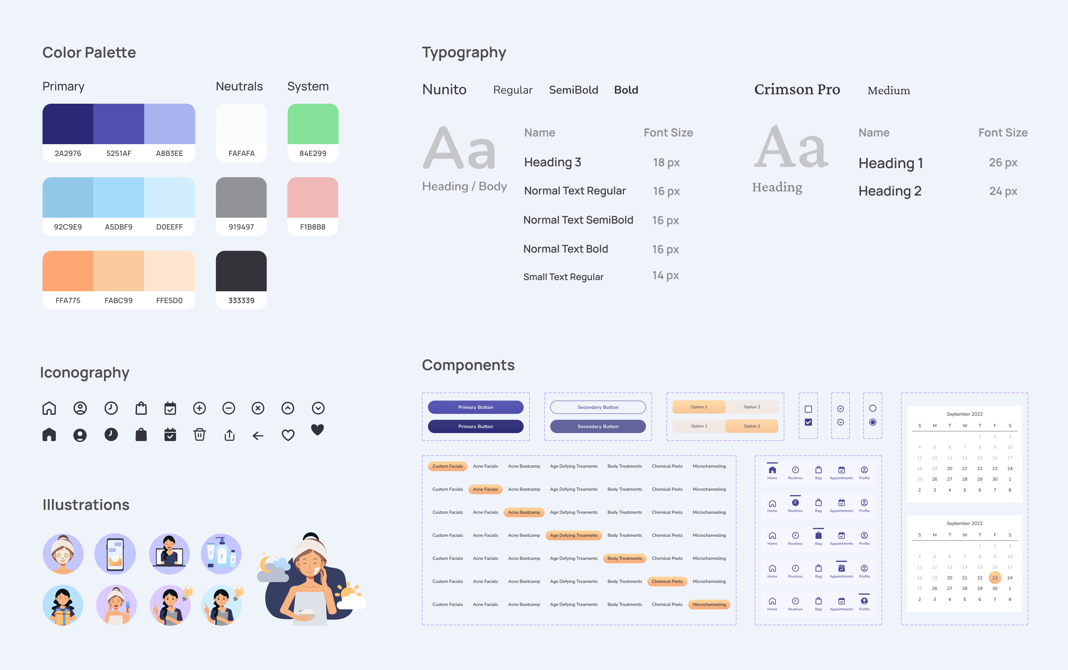
CRAFTING THE UI KIT
Creating the Foundation for Visual Consistency
After wireframing, I created a UI kit that seamlessly aligns with Skintegrity's branding. The color palette draws from their existing light blue and lavender hues, evoking a sense of calm and trust. To add vibrancy and contrast, I introduced a pastel orange inspired by the logo, ensuring key elements stand out while maintaining visual harmony. This cohesive design foundation set the stage for a user-friendly and aesthetically pleasing app experience.